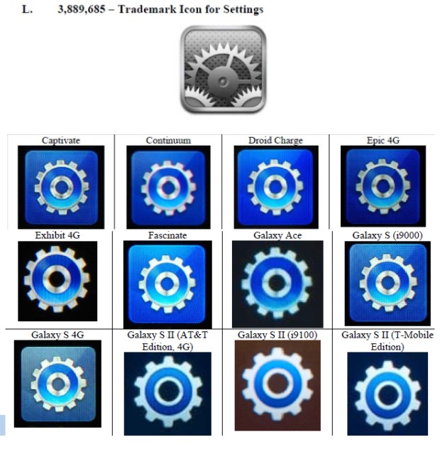
Some of the icons Apple accuses Samsung of ripping-off make for more convincing arguments than others. The “settings” icon, for instance, might not be a slam-dunk for infringement; not only is the design substantially different, but gears (or maybe a wrench) are pretty common graphical indicators for such options.
Apple’s case feels a little stronger in some of its other examples. The call icon matches Apple’s design almost to a T, with both the layout and color choices consistent. Then there are ones that do seem to reveal some degree of inspiration, but are a bit less of direct knock-offs. The contacts icon keeps the silhouette and the graphical indications of binding to remind us that it’s supposed to be a book, but otherwise departs from Apple’s design. There’s a similar situation with Apple’s icon for its Notes app; Samsung also uses a pad for its icons, but plays around with its depiction quite a bit.
It’s hard to say just how strong a case Apple is making here. Do you see clear evidence of copying? Maybe just mimicry?


 Source: CNET
Via: 9to5 Mac


Apple's stifes with everyone in their market is getting tiresome
ReplyDelete